Mobile application My Tele2


We have been developing a mobile app for Tele2
since 2014. Together we released the first version of
the “Tele2” app in black. And now, based on
analytics, technical requirements, and new guidelines, we have
changed the application logic and done the full redesign.
New design, loyalty program, Apple Pay, exchange of minutes
to gigabytes and a plan constructor — all of this
needed to be implemented ASAP. We suggested updating
gradually, and completed a partial redesign in
August 2017, then released the app with new functionality and
backend in May 2018.
The best telecom app according to Tagline Awards
4.7
App Store
4.3
Google Play
>5 000 K
users
In this project we did:
Analytics
Prototypes
Design
Development
Testing
Support
Principles of UX-design
The major principles of Tele2 guidelines are implemented
within the app: steam condition, flexibility & scalability,
wave perception management.
In the design of a new application I used
a special style of constructed elements, colored
“guillotine” and cards for information. I also rethought
navigation and screen logic according to popular user
scenarios.


Access to information
All content is located on cards. This structure enables
users to add new or hide out of date information
quickly and easily. It is possible to get the desired
data without going further than two screens.
The access to the most popular scenarios is located
on the main screen. It is possible to look
at statistics on expenses, change or set up
a plan and recharge on the main card with a single
tap.
After the start of the renewed application, it became
clear that part of the interface elements needs to be
simplified, for example, a balance card. Side by side
with the interface optimization, we designed new selections
in the app. I was interested in implementing new UX
solutions in the app, and Tele2 is satisfied with the results.
Plan constructor
We figured out how to simply and effectively shape
a plan constructor in the app. On the single screen,
users can choose the required amount of minutes, gigabytes,
social networks, messengers, and set additional options. Price
is automatically updated while making choices.
Loyalty program
We implemented this task in two steps. First in the web-view,
then natively — it was a separate part in the app.
Now users can receive discounts and cashback from Tele2 partners.


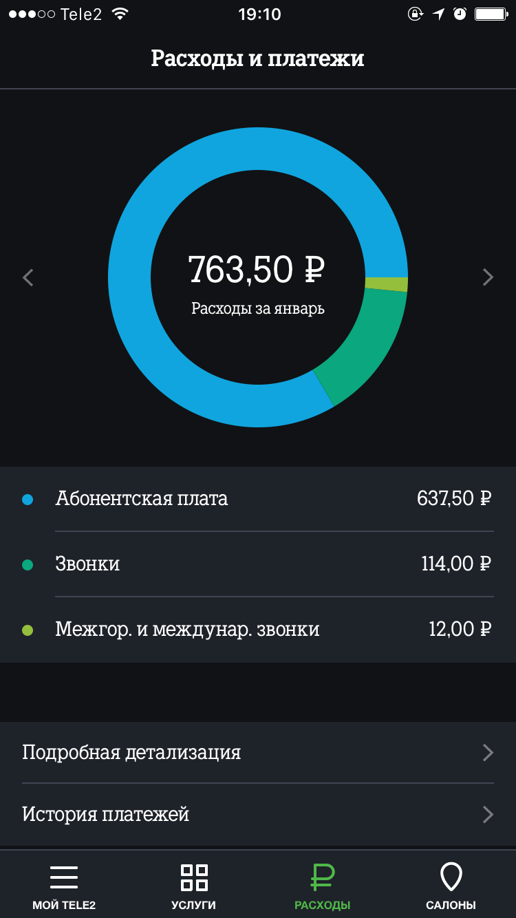
Screen of expenses
In the black version, expenses were illustrated by a colored
diagram, and fees occupied most of the space. Now
detailed display of expenses is displayed on a separate
card — making it easier and more informative.
Exchange minutes to gigabytes
Tele2 was the first provider who introduced this service
to the market in 2017. We prepared the launch under the
utmost secrecy. The exchange course is 100 minutes to
1 gigabyte.
Close communication with the client and interaction within our team
enables us to decompose tasks and think on future
features, as well as improve user experience. We work in
a two-week sprint and regularly implement new functionality and
improvements which affect positively on evaluations and reviews
in the App Store.
We were able to implement a new template based on MVP
into the project. We programmed on Kotlin and went from RxJava in
favor of coroutines. We constantly gathered and delivered
builds, both to the testing department and the client, attaching
the latest release notes from Jira. Eventually, we automatized the
processes with the use of the Jenkins Pipeline, saving more time for
the work on the project.


