Mobile App Burger King
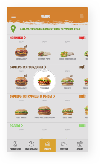
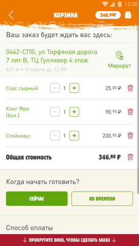
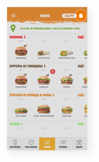
We have created an app for those who love burgers but can’t
stand queues. In the Burger King app, users can make
a preliminary order and payment, and they don’t have
to wait in line anymore — all they need to do
is to go directly to the present area, name a code
and take the ready order. For those who save their favorites,
the order becomes even simpler — just a few taps to repeat
the previous order and it’s on its way.
1 011
hours of iOS development
2 041
hours of Android development
№ 3
in “Food and Drinks” category in the App Store
3 000 K
users
In creating the Burger King app we solved two problems: shortened
customer wait time and increased the number of orders by means
of an additional sales channel for the client. The app
is also available offline. Users can look through the menu and find
deals at Burger King restaurants even without having a connection
to the Internet.
In this project we did:
Analytics
Prototypes
Design
Development
Testing
Support
We put together a cool and flexible utility for uploading images
based on Glide. Implemented efficient data caching on the application
side, which enabled our users to save traffic and considerably
decrease the load on the servers.
We created schedulers of network exchange with a central server, which
proportion loads on the network according to current order
status and saves traffic and battery on mobile devices.
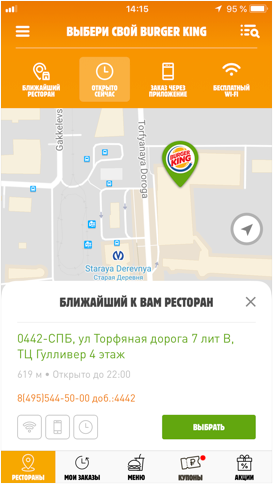
Finding the nearest restaurant
The app will direct a user to a nearby Burger King
and map out a route. It is convenient for those
who happen to be in a new place.

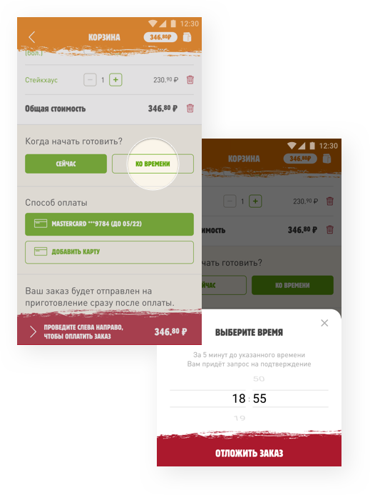
Postponed order
This feature enables users to arrange an order for a convenient
time. Five minutes before the arranged time a push notification pops
up and reminds the user to pay for and submit
the order to be prepared.
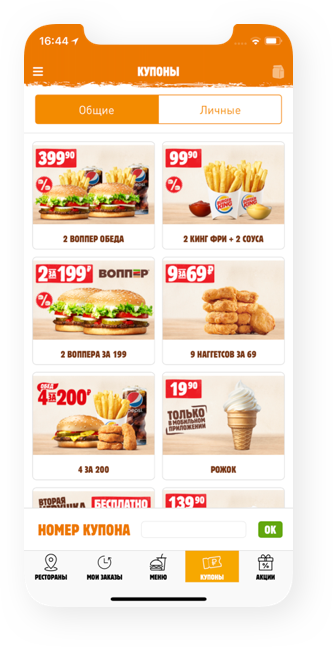
Coupons
A loyalty program allows users to buy their favorite burgers with a good discount.
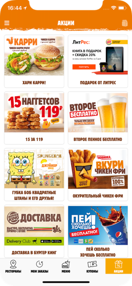
Deals
Users are first to learn of deals provided by Burger King restaurants and Burger King’s partners.
We used the Figma tool which became a magic wand for the whole
team and sped up the process of app creation. For interface
development, we took traditions from Material Design as a base
and adjusted Burger King’s corporate style to guidelines
for mobile platforms.
